Neutral color schemes in Scandinavian design represent more than just a palette; they embody a philosophy. This design aesthetic, characterized by its minimalist approach and emphasis on functionality, leverages the inherent versatility of neutral tones – off-whites, beiges, grays, and blacks – to create spaces that are both calming and sophisticated. The interplay of light, texture, and strategically placed accent colors transforms these seemingly simple hues into a dynamic and inviting atmosphere, reflecting the core principles of Scandinavian hygge: comfort, coziness, and connection with nature.
The effectiveness of this design style hinges on understanding how variations in shade and tone impact the overall mood. A creamy off-white can exude warmth, while a cool gray can instill a sense of serenity. The strategic incorporation of natural materials like wood, wool, and linen adds textural depth, preventing the neutral palette from feeling flat or sterile. This careful layering of elements is what elevates a simple color scheme into a truly captivating design statement.
Defining Neutral Color Schemes in Scandinavian Design
Scandinavian design, renowned for its minimalist aesthetic and emphasis on functionality, relies heavily on neutral color palettes to create serene and inviting spaces. This approach leverages the psychological impact of color to enhance feelings of calm, spaciousness, and well-being, aligning perfectly with the region’s emphasis on hygge – a sense of coziness and contentment. The careful selection and application of neutral shades are key to achieving this signature style.The core principle of a neutral color palette in Scandinavian interior design is the prioritization of colors that recede visually, allowing light to reflect and amplify the sense of space.
This is particularly crucial in the often dimly lit Nordic winters. The palette is not simply a collection of bland shades, however. Instead, it utilizes subtle variations in hue, saturation, and value to create depth, texture, and visual interest, avoiding monotony. The skillful interplay of these variations allows designers to craft diverse atmospheres, from the bright and airy to the warm and inviting.
Neutral Color Variations and Their Atmospheric Effects
Variations in shades and tones of neutral colors profoundly impact the mood and atmosphere of a Scandinavian-designed space. Lighter shades, such as off-whites and very light greys, create a sense of openness and airiness, making smaller rooms feel larger and brighter. Conversely, deeper shades, such as charcoal grey or deep beige, introduce a sense of warmth and coziness, particularly effective in creating intimate and inviting corners.
The interplay of light and shadow on these surfaces further enhances this textural effect. The strategic use of both light and dark neutrals can also create a sense of balance and visual harmony, preventing the space from feeling sterile or monotonous. For instance, a light grey wall might be paired with darker grey furniture and accessories to create visual interest without sacrificing the overall neutral palette.
Examples of Neutral Colors in Scandinavian Design
The following table illustrates common neutral colors used in Scandinavian design, their shades, typical applications, and the moods they evoke. The shades listed represent a spectrum, and many variations exist within each color family.
| Color | Shade | Scandinavian Application | Mood Evoked |
|---|---|---|---|
| Off-White | Warm White, Slightly Creamy White | Walls, Textiles, Upholstery | Clean, Airy, Bright, Spacious |
| Beige | Light Beige, Taupe, Greige (grey-beige) | Flooring, Furniture, Accessories | Warm, Inviting, Cozy, Relaxed |
| Grey | Light Grey, Medium Grey, Charcoal Grey | Walls, Furniture, Textiles | Sophisticated, Calm, Serene, Modern |
| Black | Deep Black, Anthracite | Accent Pieces, Fixtures, Framing | Dramatic, Grounding, Elegant, Defined |
The Role of Natural Light and Texture
The interplay of natural light and textural elements is paramount in achieving the characteristic warmth and depth of a Scandinavian-inspired neutral color scheme. Neutral palettes, while inherently versatile, can appear flat or sterile without careful consideration of how light interacts with surfaces and how varied textures enrich the visual experience. The careful selection and arrangement of materials are key to avoiding a monotonous aesthetic.Natural light’s influence on neutral colors is multifaceted.
The spectral composition of daylight, particularly its shift throughout the day, subtly alters the perception of neutral shades. A warm, off-white wall might appear creamy under the morning sun, yet subtly cooler under the softer light of twilight. This dynamic interaction prevents visual monotony and adds a sense of living, breathing space. The intensity of the light also impacts the perceived lightness and darkness of the neutrals, adding a further layer of complexity to the overall design.
For example, a light grey might appear almost white in bright sunlight, creating a sense of airy spaciousness, while appearing more substantial and grounded in low light.
Natural Light’s Impact on Neutral Color Perception
The spectral power distribution of daylight significantly influences how we perceive color. Sunlight is not a single wavelength but a spectrum of colors. The relative proportions of these wavelengths vary throughout the day, influencing the color temperature (perceived warmth or coolness) of the light. This, in turn, affects how we see neutral tones. A cool-toned neutral, such as a light grey, might appear slightly bluer in the cool light of a cloudy day, while a warmer neutral, like a beige, might seem richer and more golden in the warmer light of the setting sun.
This dynamic interaction creates a visually engaging environment that shifts and evolves with the time of day. This effect is amplified in Scandinavian interiors, which often feature large windows designed to maximize natural light.
Textural Interaction with Neutral Colors
The introduction of texture is crucial for breaking up the potential monotony of a neutral palette. Different materials possess varying reflective properties, influencing how light interacts with them and, consequently, how the eye perceives both the texture and the color. The interplay between light and texture creates visual depth and interest, transforming a potentially flat space into a rich and inviting environment.
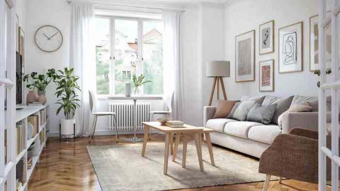
A Hypothetical Living Room Design
Imagine a living room bathed in natural light from large, north-facing windows. The walls are painted in a soft, warm off-white (“Cloud White,” similar to Farrow & Ball’s color), creating a bright and airy backdrop. The flooring is wide-plank, lightly oiled oak, its natural grain and subtle variations in tone adding warmth and visual interest. A large, chunky-knit wool rug in a natural cream color anchors the seating area, its tactile texture offering a contrast to the smooth oak floor.
A linen sofa, in a light grey-beige (“Stone Grey”), provides a comfortable seating area. Several throw pillows in varying textures—a bouclé wool, a linen blend, and a cotton velvet—add pops of subtle color and textural variety, complementing the neutral scheme without overwhelming it. A coffee table crafted from reclaimed wood with a rough, unfinished top provides a rustic contrast to the smoother elements of the room, emphasizing the interplay of textures.
The overall effect is one of calm sophistication, with the neutral palette enhanced, rather than overshadowed, by the carefully chosen textures and the dynamic play of natural light.
Incorporating Accent Colors Strategically

The foundation of Scandinavian design lies in its neutral palette, but strategic use of accent colors elevates the aesthetic, injecting personality and visual interest without compromising the core principles of minimalism and functionality. The careful introduction of color acts as a powerful tool, impacting mood, highlighting architectural features, and enriching the overall sensory experience. The choice between bold and muted accents significantly alters the final effect, offering a spectrum of design possibilities.The effect of an accent color is profoundly influenced by its inherent properties, particularly its hue, saturation, and value.
Understanding the color wheel and its relationships is crucial for successful implementation. For instance, analogous colors (those adjacent on the wheel) create a harmonious and cohesive feel, while complementary colors (opposite each other) generate a more vibrant and dynamic contrast. These principles, grounded in color theory, guide the selection of accents that either subtly enhance or boldly punctuate the neutral backdrop.
Examples of Accent Colors Complementing Neutral Scandinavian Palettes
Several color families harmoniously complement the muted tones typical of Scandinavian interiors. Deep blues, reminiscent of a Nordic twilight sky, evoke a sense of calm and tranquility. These shades, when used sparingly, can add depth and sophistication to a room without overwhelming the neutral palette. Similarly, earthy greens, inspired by the region’s lush forests, introduce a natural element that connects the interior space with the outdoors.
These colors, often found in textiles or artwork, bring a sense of life and vibrancy. Warm, muted yellows, reminiscent of sunlight filtering through birch trees, add a cheerful and welcoming touch. These are often used in smaller doses, such as in throw pillows or lamps, to brighten a room without being jarring.
Comparison of Bold Versus Muted Accent Colors
Bold accent colors, such as a saturated emerald green or a vibrant turquoise, command attention and create a strong visual statement. They are effective for highlighting specific features, such as a fireplace or a piece of artwork. However, their impact requires careful consideration; overuse can disrupt the calm ambiance of a Scandinavian space. In contrast, muted accent colors, such as dusty rose or sage green, offer a more subtle and refined approach.
These shades blend seamlessly with the neutral palette, adding depth and texture without overpowering the overall design. They create a sense of understated elegance, enhancing the feeling of spaciousness and serenity. Consider, for example, a bold red accent wall in a Scandinavian living room – it might be visually striking but potentially overwhelming. A muted terracotta, however, could provide warmth and depth without the same level of intensity.
Accent Colors Suitable for a Neutral Scandinavian Bedroom
A neutral Scandinavian bedroom benefits from accent colors that promote relaxation and tranquility. The goal is to create a sanctuary that fosters rest and rejuvenation.
- Soft blues and greys: These cool tones evoke a sense of calm and serenity, mimicking the peaceful atmosphere of a Nordic winter landscape. Their calming effect is scientifically supported by studies linking blue to reduced heart rate and blood pressure.
- Muted greens: Shades like sage or eucalyptus green connect the bedroom with nature, creating a tranquil and restorative environment. The visual association with nature has a demonstrably positive effect on stress reduction.
- Warm, light neutrals: Subtle variations in beige, cream, or taupe can add visual interest and texture without disrupting the overall neutral scheme. These shades provide a sense of warmth and comfort without being overpowering.
Furniture and Decor Choices
Scandinavian design, renowned for its minimalist aesthetic and functionality, seamlessly integrates with neutral color schemes. The inherent simplicity of Scandinavian furniture and decor allows for a focus on quality materials and craftsmanship, enhancing the overall effect of a calming and sophisticated space. Careful selection of pieces, both in terms of form and function, is crucial to achieving the desired balance.The core principles of Scandinavian design—simplicity, functionality, and natural materials—dictate the choice of furniture.
Light-colored woods like birch and ash, often featuring clean lines and simple silhouettes, are paramount. These pieces create a sense of airiness and spaciousness, crucial in maximizing the effect of natural light, a cornerstone of Scandinavian interiors. Upholstered furniture, if included, should feature light-colored fabrics like linen or wool, maintaining the overall lightness of the scheme. Avoid overly ornate or heavily patterned pieces; instead, opt for understated elegance and timeless design.
Selection of Artwork and Decorative Elements
Artwork and decorative elements play a vital role in enriching a neutral Scandinavian palette. The key is to introduce color and texture subtly, avoiding any clash with the overall minimalist aesthetic. Abstract art in muted tones, featuring soft gradients and understated shapes, works exceptionally well. Similarly, natural elements such as dried flowers, branches, or stones in simple glass vases or bowls can add visual interest without disrupting the calm atmosphere.
Consider incorporating tactile textures through woven throws, sheepskin rugs, or ceramic pieces with interesting surface details. The goal is to layer texture and visual interest gradually, building depth and complexity without sacrificing the sense of serenity. Avoid overwhelming the space with too many decorative elements; less is often more in this context. For instance, a single, striking piece of pottery can have a more significant impact than a cluster of smaller, less impactful items.
Visual Description of a Neutral Scandinavian Kitchen
Imagine a kitchen bathed in soft, natural light, its walls painted in a warm, off-white hue. The cabinetry is crafted from light oak, its clean lines and simple handles exuding a sense of understated elegance. A large, farmhouse-style kitchen table made from light-colored wood sits in the center of the room, surrounded by simple, yet comfortable, linen-upholstered chairs.
Above the table hangs a single, minimalist pendant light made of natural materials, such as woven rattan or spun glass, providing a soft, ambient glow. On the countertops, a few carefully selected accessories are visible: a sleek, stainless-steel kettle, a simple ceramic bowl filled with fresh fruit, and a small vase containing a single, delicate branch. A woven rug, perhaps in a natural jute or wool, anchors the space and adds a layer of warmth and texture underfoot.
The overall effect is one of calm, functionality, and understated sophistication, a true reflection of the core principles of Scandinavian design. The cool tones of the stainless steel appliances contrast subtly with the warmth of the wood and the neutral tones of the walls and textiles, creating a balanced and harmonious space. The absence of clutter emphasizes the clean lines and simple forms of the furniture and fittings, creating a feeling of spaciousness and tranquility.
Variations on the Neutral Theme

The inherent flexibility of a neutral Scandinavian color palette allows for a remarkable range of stylistic interpretations, moving seamlessly between minimalist austerity and rustic warmth. Understanding the interplay of color, texture, and light is key to achieving the desired aesthetic. The following sections explore these variations and demonstrate how subtle shifts can dramatically alter the overall feeling of a space.
Minimalist Neutral Schemes
A minimalist neutral Scandinavian scheme prioritizes clean lines, uncluttered spaces, and a sense of airy openness. This is achieved through a limited color palette, typically featuring shades of white, off-white, light gray, and perhaps a very pale beige. The focus is on functionality and simplicity. Textures are kept minimal, often utilizing smooth surfaces and streamlined furniture. Natural light is maximized through large windows and strategically placed mirrors, reflecting and amplifying the existing light.
For instance, a living room might feature a white sofa, light gray walls, and a pale wood coffee table, all against a backdrop of large, unadorned windows. The effect is one of serene spaciousness and tranquility.
Rustic Neutral Schemes
In contrast to the minimalist approach, a rustic neutral Scandinavian scheme embraces the warmth and texture of natural materials. While still predominantly neutral, the color palette expands to include warmer shades of beige, taupe, and even muted browns. Natural textures become prominent, with materials like untreated wood, linen, wool, and stone playing a crucial role. The overall feeling is one of cozy comfort and inviting warmth.
Imagine a bedroom with walls painted in a warm beige, featuring a bed with a linen headboard and a chunky knit throw, complemented by a wooden nightstand and a sheepskin rug. The natural textures and warmer tones create a sense of grounded, comforting intimacy.
Introducing Warmth and Coolness
The temperature of a neutral Scandinavian space can be subtly adjusted through strategic color choices and material selection. To introduce warmth, incorporate warmer shades of white (like cream or ivory) and beige, along with natural materials like wood with a warm honey tone or wool textiles in earthy hues. Conversely, to create a cooler atmosphere, opt for cooler shades of gray, white with blue undertones, and materials like polished concrete or linen in light, airy colors.
The use of metallic accents, such as brushed nickel or stainless steel, can further enhance a cool aesthetic.
Contrast Levels in Neutral Scandinavian Design
Contrast plays a vital role in shaping the visual impact of a neutral Scandinavian space. High contrast can be achieved by pairing stark white walls with dark wood furniture or black accents. This creates a dramatic and sophisticated look. Medium contrast might involve using various shades of beige and gray, creating a more harmonious and subtle variation in tone.
Low contrast, on the other hand, employs a very limited range of similar shades, resulting in a calm and unified aesthetic. For example, a living room with off-white walls, a light gray sofa, and a cream-colored rug would represent low contrast, while a bedroom with crisp white walls and dark brown wooden furniture would exemplify high contrast.
Illustrative Examples
The following examples demonstrate the practical application of neutral color schemes in Scandinavian design, showcasing how the interplay of color, texture, and natural light can create distinct and inviting atmospheres in different living spaces. These examples are grounded in the principles of biophilic design, leveraging the positive psychological effects of natural materials and light.
Beige Scandinavian Living Room
This living room embraces a warm, inviting atmosphere through a predominantly beige color palette. The walls are painted in a soft, creamy beige, reflecting natural light effectively and creating a sense of spaciousness. The flooring is composed of light oak planks, contributing to the overall warmth and echoing the natural tones of the walls. A large, plush beige sofa, upholstered in a linen blend, anchors the space.
Its texture adds visual interest, contrasting subtly with the smoother surfaces of the coffee table, crafted from light-colored wood with a natural, unpolished finish. Several sheepskin throws are casually draped over the sofa and armchairs, introducing tactile softness and reinforcing the natural material theme. Ambient lighting is provided by a large, circular pendant lamp made of woven rattan, diffusing light gently throughout the room.
Task lighting is achieved through a sleek, minimalist floor lamp with a linen shade, positioned near a reading chair. Decorative elements include a collection of ceramic vases in varying shades of beige and cream, showcasing a minimalist yet textural aesthetic. The overall effect is one of calm sophistication, emphasizing comfort and connection with nature.
Gray and White Scandinavian Bedroom
This bedroom exemplifies a cooler, more serene Scandinavian aesthetic using a gray and white palette. The walls are painted in a soft, cool gray, providing a neutral backdrop that enhances the feeling of spaciousness and calm. The ceiling is painted white, reflecting light and increasing the sense of airiness. The floor is covered with a light gray wool rug, adding warmth underfoot and softening the hard surface.
The bed features a white linen duvet cover and crisp white sheets, emphasizing simplicity and cleanliness. Two gray wool throw pillows add texture and visual interest, complementing the overall color scheme. A white wooden dresser with simple, clean lines provides storage and complements the minimalist aesthetic. A delicate, white lace curtain filters natural light, creating a soft, diffused glow.
A single, minimalist pendant light above the bed provides focused illumination, while a small bedside table lamp with a white shade offers soft reading light. Decorative elements are minimal, consisting of a simple gray ceramic vase and a framed botanical print, reinforcing the natural and calming elements of the design. The overall mood is tranquil and restful, promoting relaxation and sleep.
The cool gray and white create a feeling of serenity and cleanliness, ideal for a restful sleep environment. The incorporation of natural materials, like the wool rug and linen bedding, further enhances the sense of comfort and well-being.
Final Conclusion
Ultimately, the beauty of a neutral Scandinavian design lies in its adaptability. Whether aiming for minimalist simplicity or rustic charm, the core principles remain consistent: a foundation of calming neutrals, enhanced by natural light, textural richness, and thoughtfully chosen accent colors. The result is a space that feels both effortlessly stylish and profoundly welcoming, a testament to the power of thoughtful design and the enduring appeal of Scandinavian aesthetics.
The ability to modulate warmth and coolness, and to control contrast levels, allows for personalized expressions within this inherently flexible framework, making it a timeless and versatile choice for modern living.
Questions and Answers
What are the best lighting choices for a neutral Scandinavian space?
Natural light is paramount. Supplement with warm-toned LED lighting for ambiance and task lighting as needed, avoiding harsh overhead fluorescents.
How can I avoid a neutral scheme feeling too cold?
Incorporate warm-toned neutrals like beige and cream, and add textural elements such as sheepskin rugs or chunky knit throws. Warm-toned wood furniture also helps.
What are some common mistakes to avoid?
Overusing stark white, neglecting texture, and failing to incorporate sufficient lighting are common pitfalls. A balanced approach is key.
How do I choose the right accent color?
Consider the mood you want to create. Muted blues and greens evoke calmness, while mustard yellows or terracotta add warmth. Start with small accents to gauge the effect.
Can I use patterned fabrics in a neutral Scandinavian design?
Yes, but use them sparingly and choose patterns that complement the overall palette. Subtle geometric patterns or natural motifs work well.
Leave a Reply